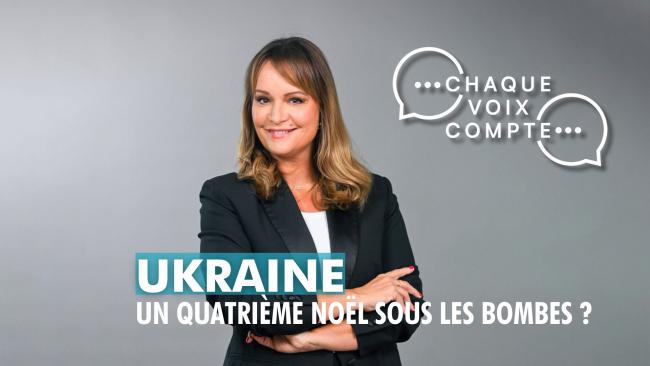
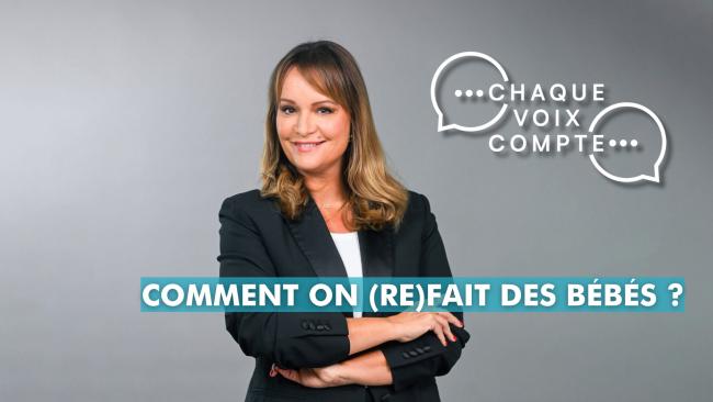
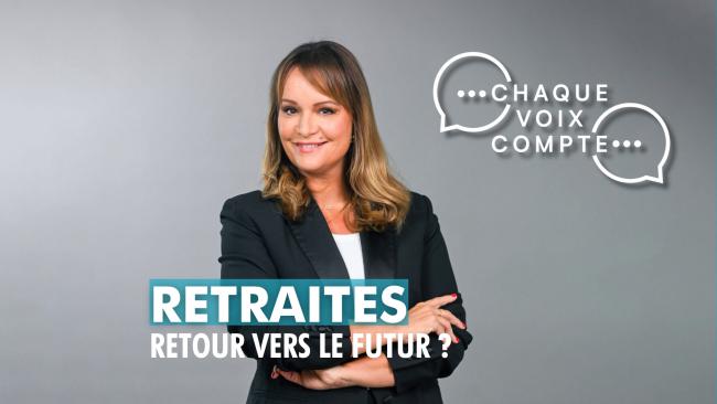
Deux minutes pour comprendre
Chronicle opener · editorial explanation
A complete visual language for Chaque Voix Compte: programme identity, broadcast infographics, recurring motion and LCP web formats.
CHAQUE VOIX COMPTE · SEASON 1
This record brings together the programme identity, daily broadcast infographics, chronicle openers and LCP web direction. The common thread is a clear, contemporary language designed for the public channel of the Assemblée nationale.
MOTION RECORD
Chronicle openers and audience-participation modules give each sequence a distinctive entrance while preserving the same rhythm, colour field and speech-based visual grammar across Chaque Voix Compte.
VISUAL RECORD
Programme titles, information hierarchy, participation and studio applications are designed as one durable on-air language.
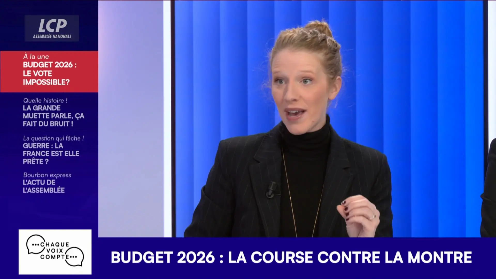
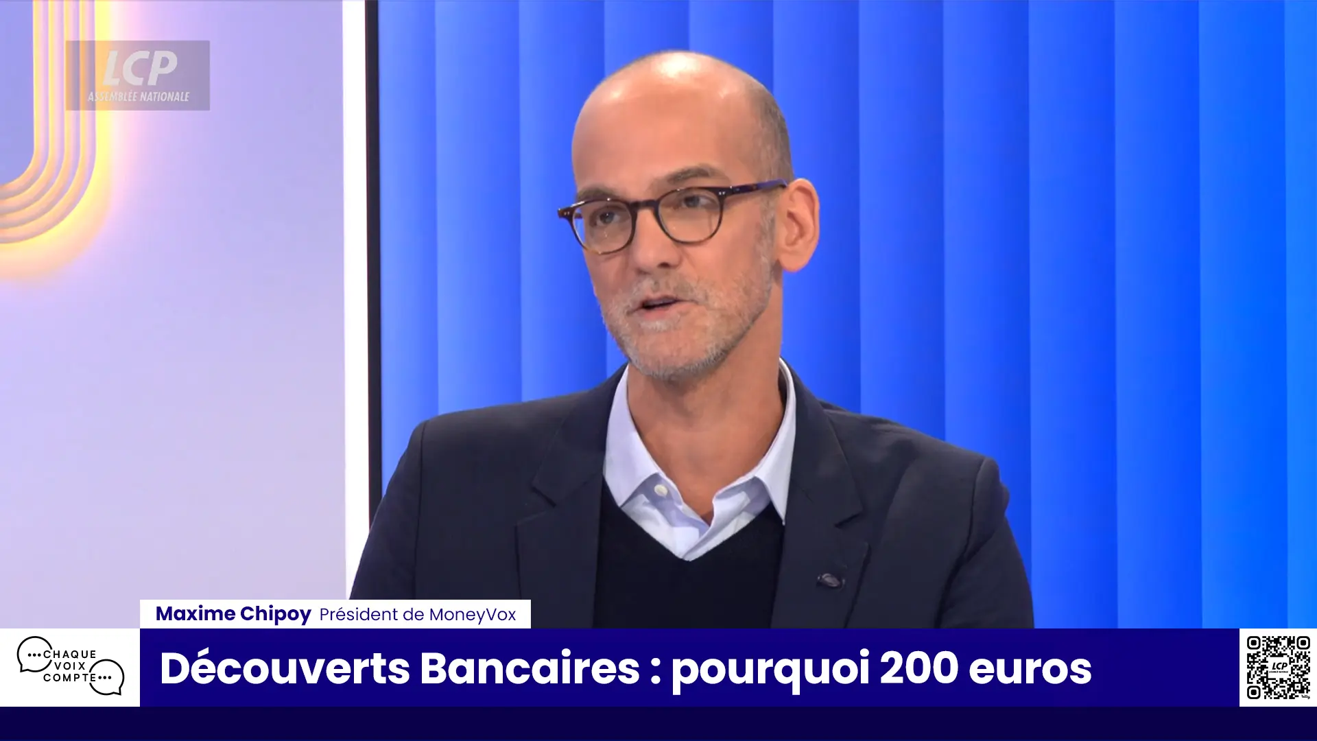
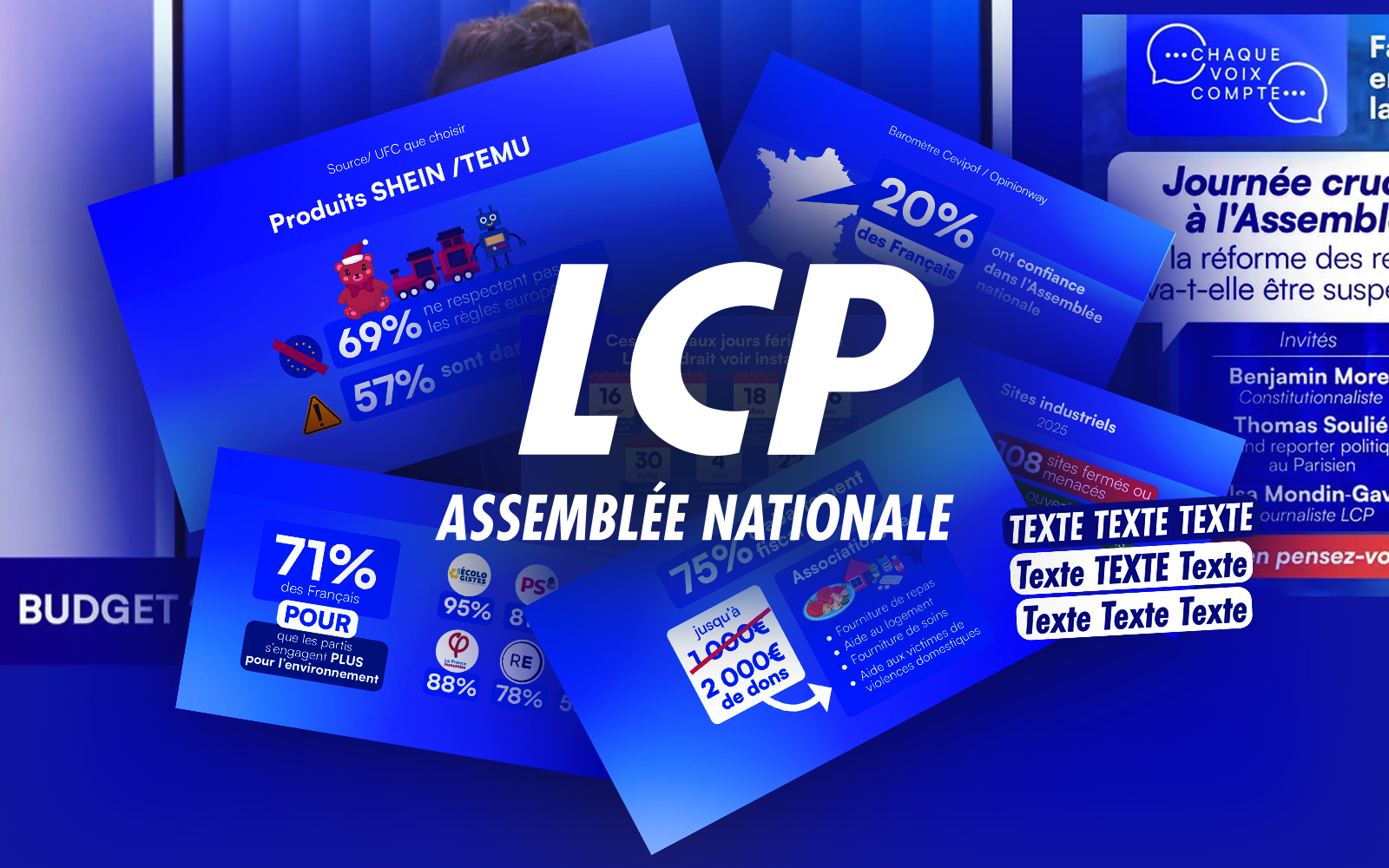
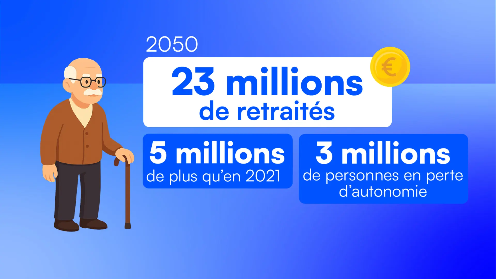
A selected set of daily on-air graphics shows the range of editorial formats: illustrated data, charts, maps, rankings, polls, quotations and document-led explanation.
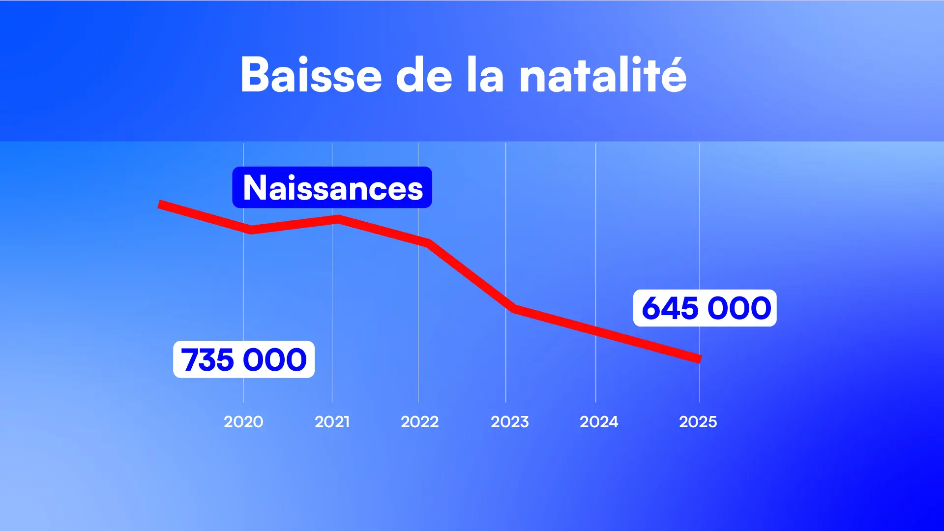
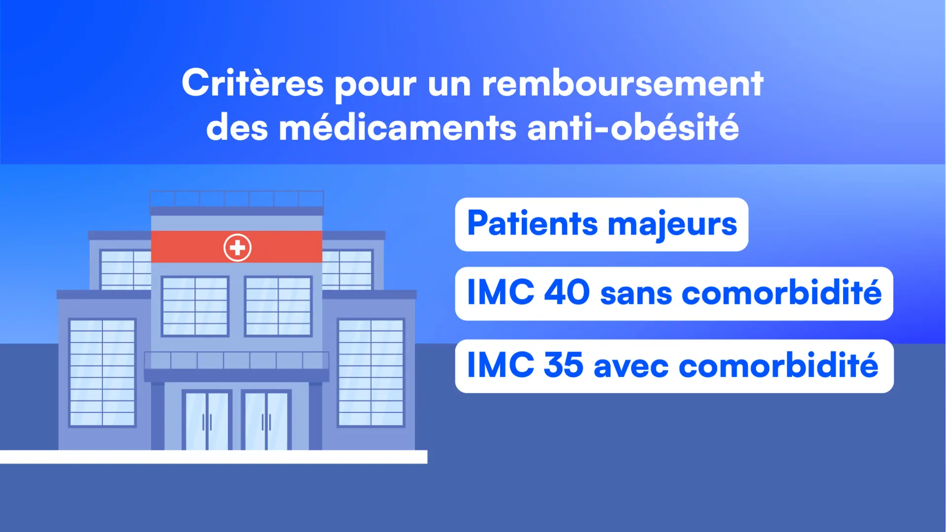
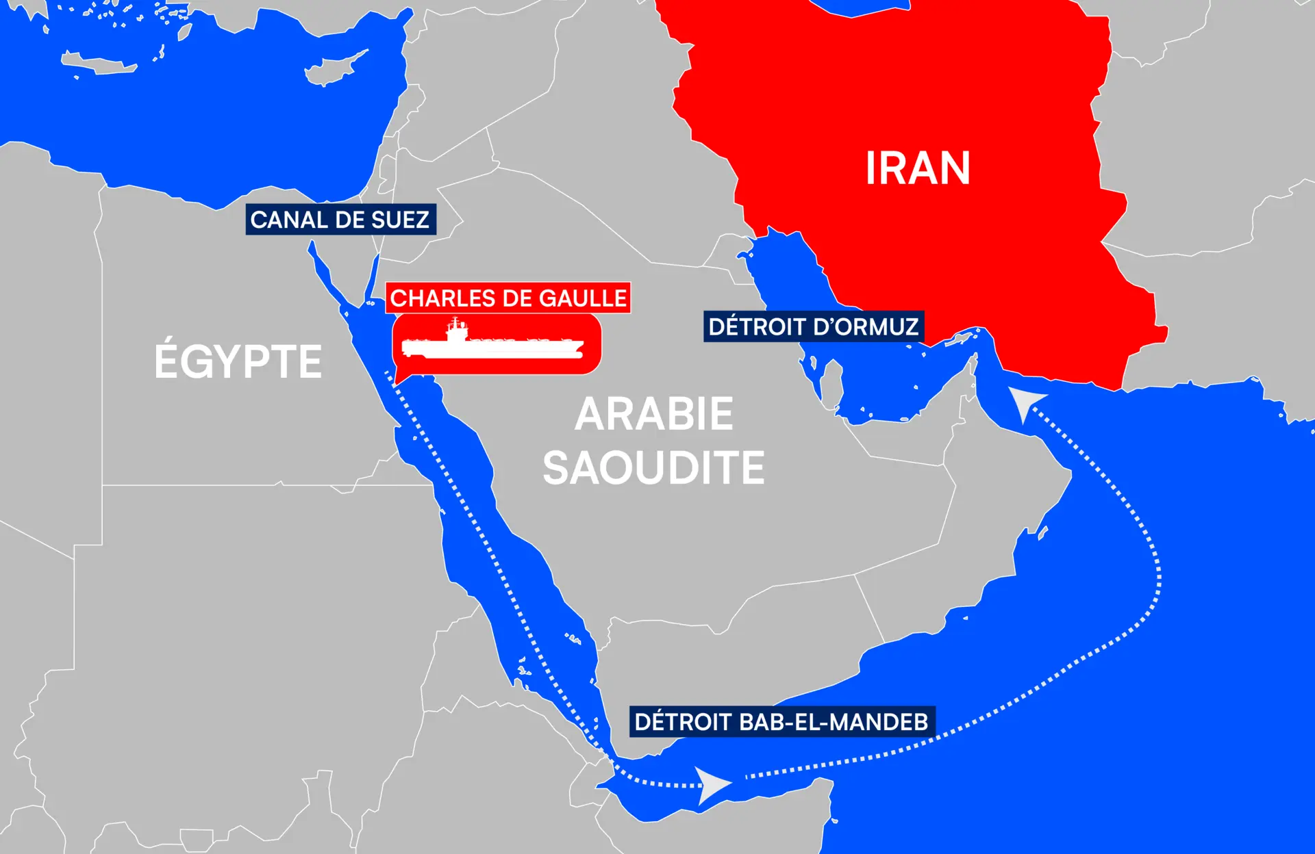
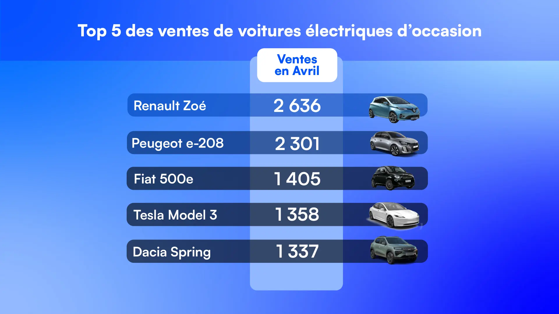
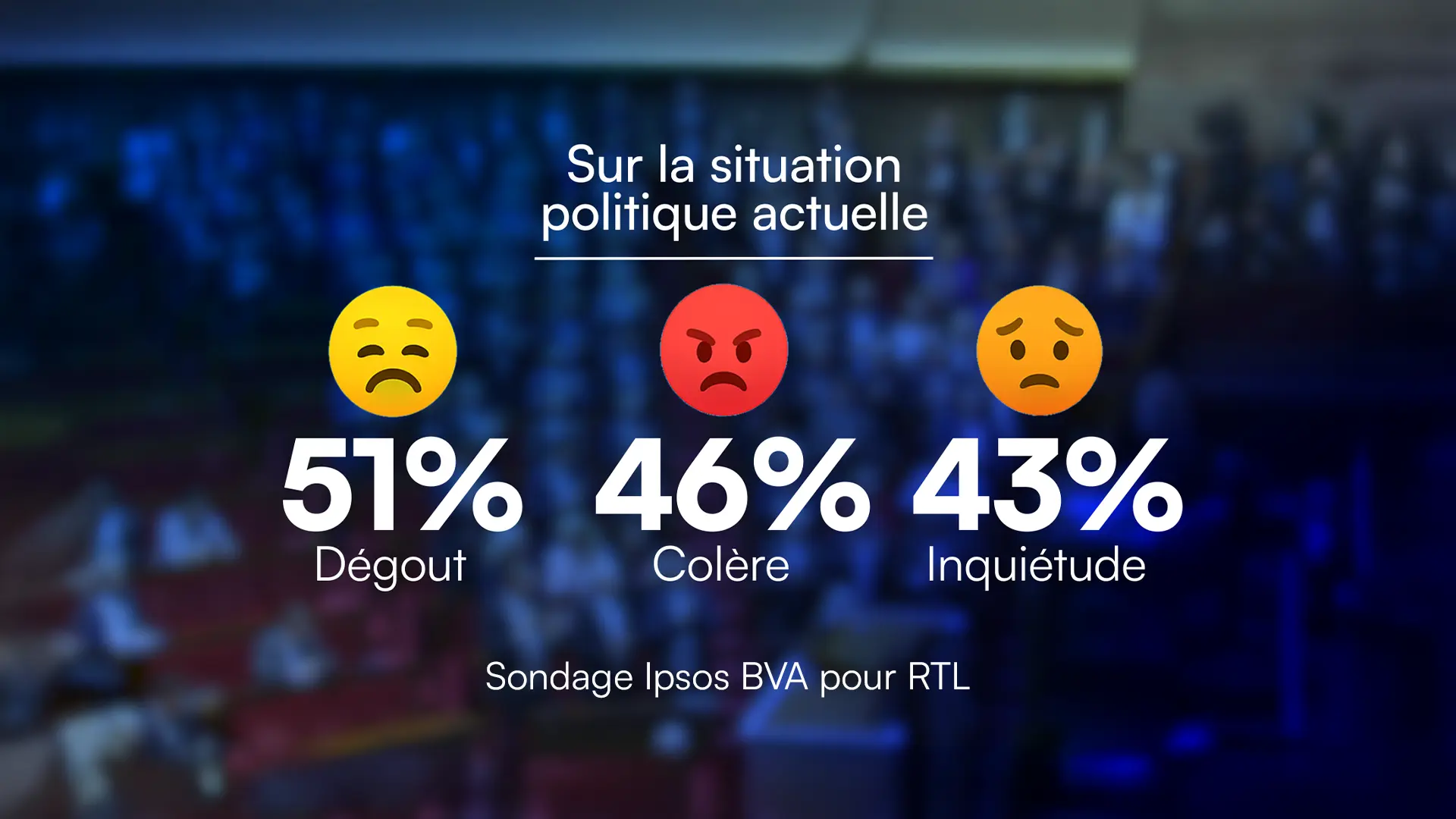
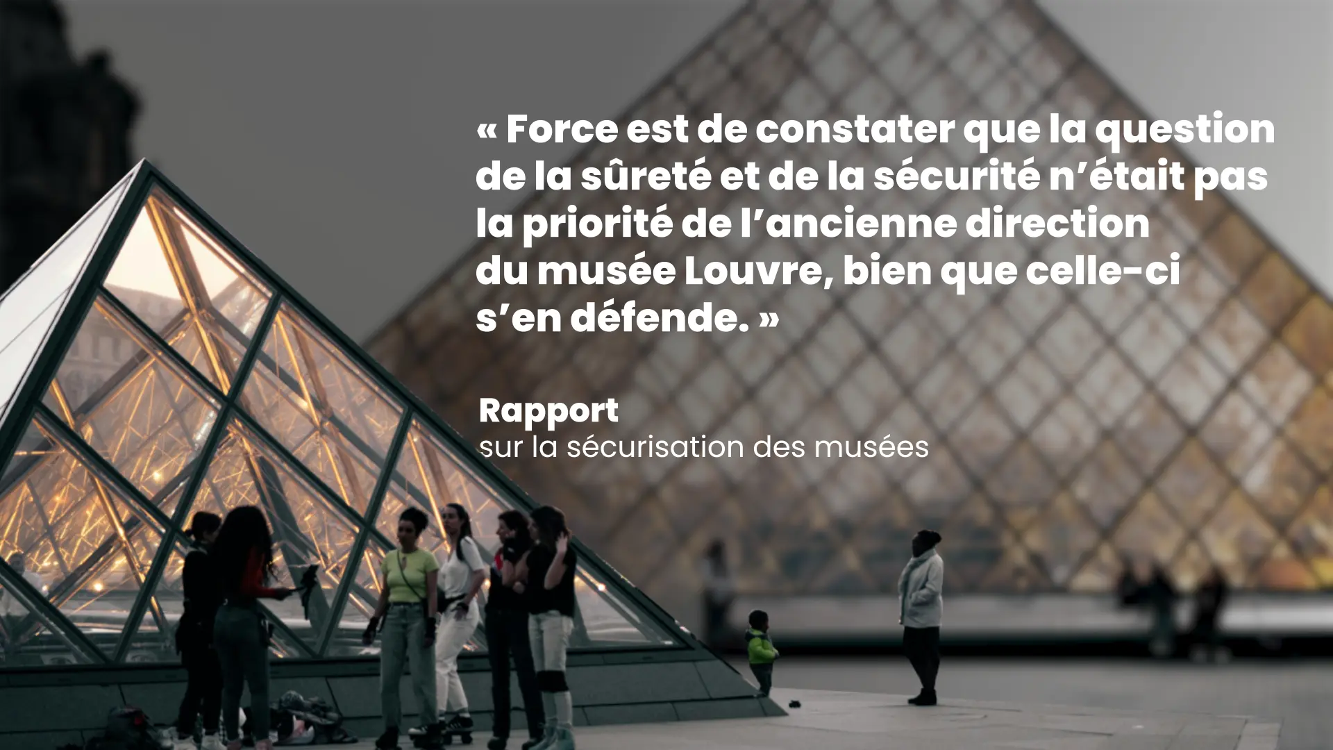
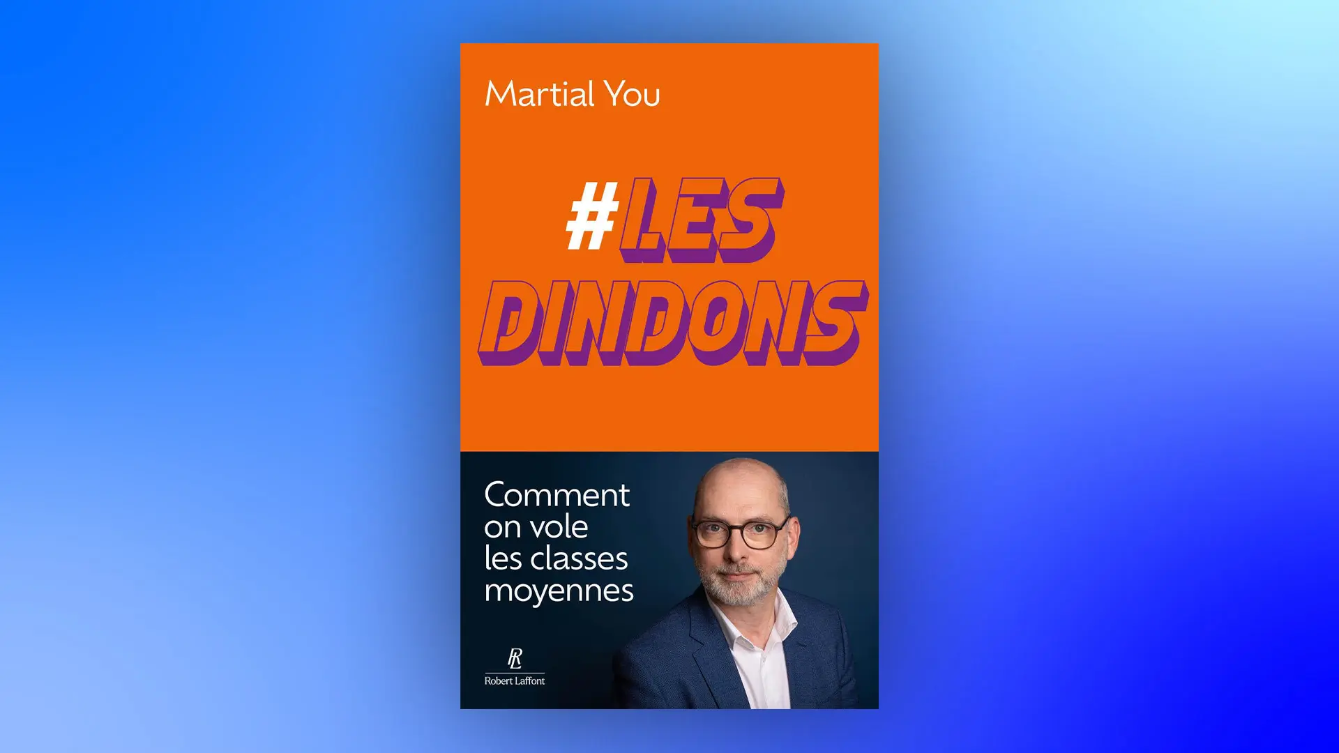
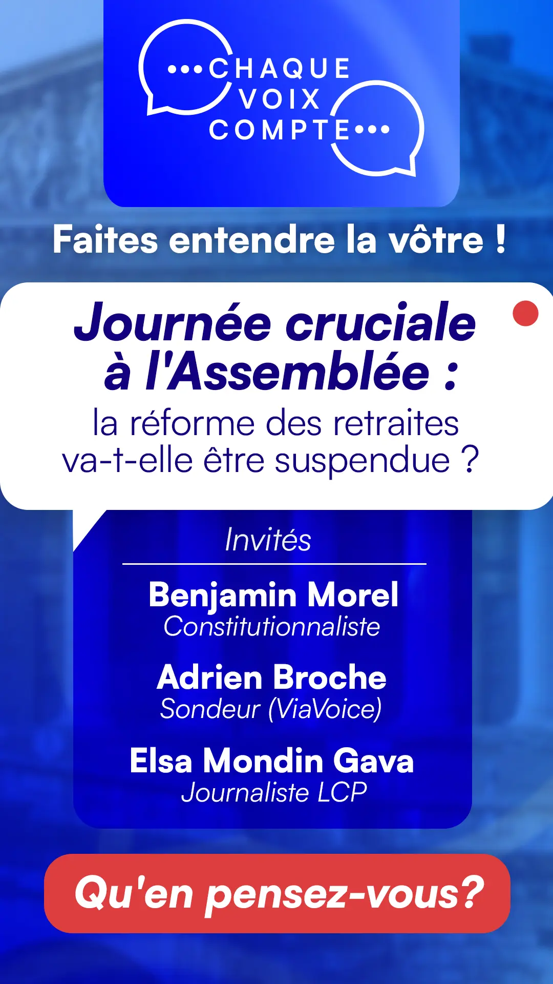
Promotional and editorial modules extend the programme identity to mobile publishing through format-specific compositions rather than automatic crops.
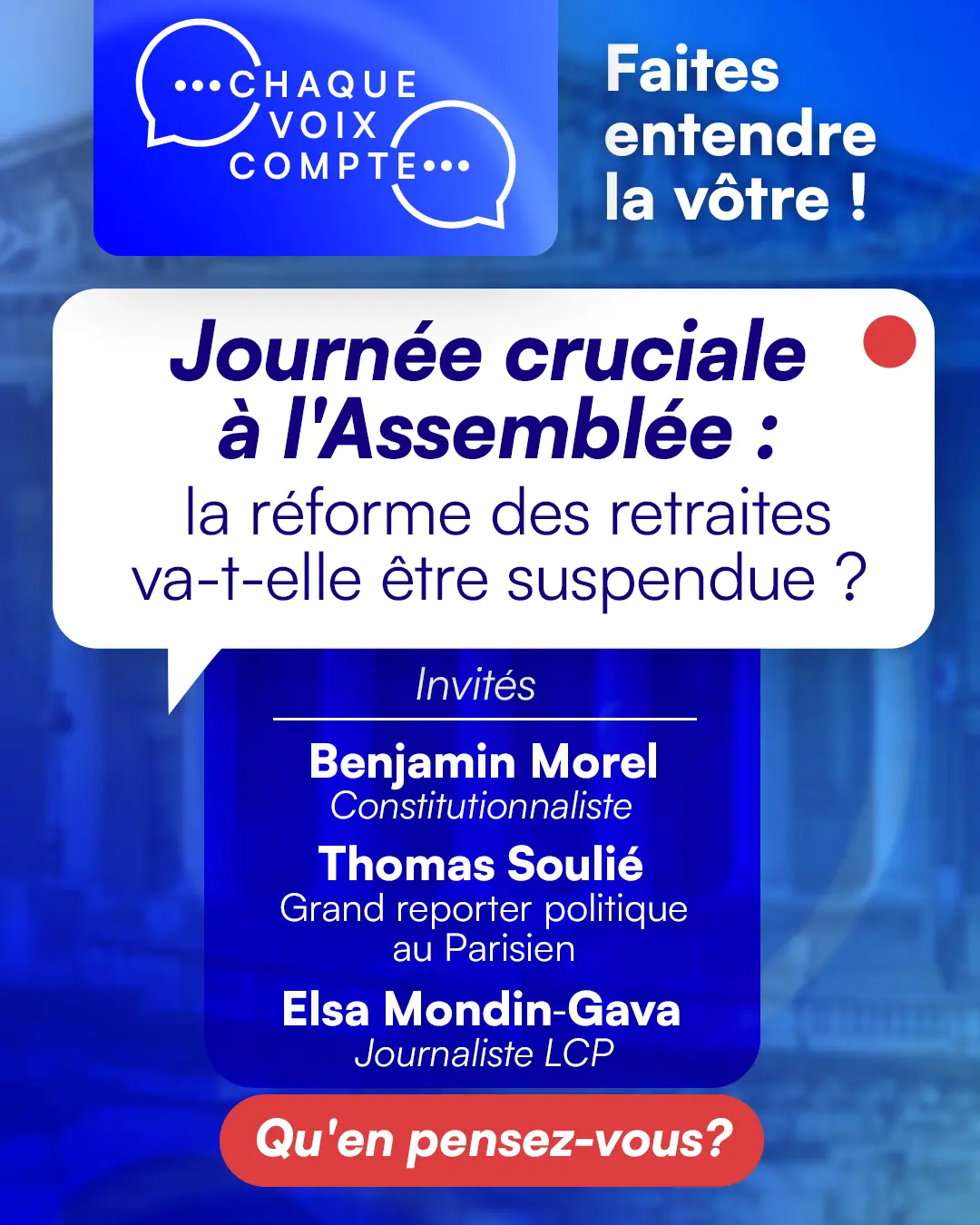
COMMISSION
On joining LCP, the commission was to define the first-season design of Chaque Voix Compte: give the programme a contemporary presence connected to today’s public debate, while preserving the legibility and restraint expected from the public channel of the Assemblée nationale.
PROGRAMME IDENTITY
The identity was developed as a complete on-air language rather than a single opener. Titles, transitions, jingles, topic cards, participation prompts and studio graphics share the same typographic hierarchy, blue spectrum and speech-bubble logic.
INFOGRAPHIC FAMILY
Daily graphics translate political, social and economic subjects into an immediate reading order. Maps, rankings, timelines, quotations, polls, diagrams and illustrated figures can change tone with the story while remaining part of one identifiable family.
RECURRING MOTION
Openers for Vox Pop and Deux minutes pour comprendre, together with audience-participation modules, use distinct imagery but a shared pace and motion grammar. This gives each editorial sequence a clear entrance without fragmenting the programme identity.
ROLE & PRODUCTION
As principal graphic designer and infographic designer, I defined the visual logic and produced the assets used on air. The role covered creative direction, graphic and motion design, template construction, editorial adaptation and day-to-day execution with the programme and broadcast teams.
LCP WEB
In parallel, I developed web and social art direction for LCP through reusable editorial layouts and promotional formats. Portrait, 4:5 and 9:16 compositions preserve the programme hierarchy on mobile instead of simply cropping a broadcast screen.
CONTINUITY
The system was made to absorb new subjects and repeated production without becoming visually exhausted. The identity developed for season one now provides a coherent foundation while season two is in preparation.